Here’s a perspective on personal income for production and nonsupervisory private employees going back five decades. The Bureau of Labor Statistics has been collecting data on this workforce cohort since 1964. The government numbers provide some excellent insights on the income history of what we might think of as the private middle class wage earner.
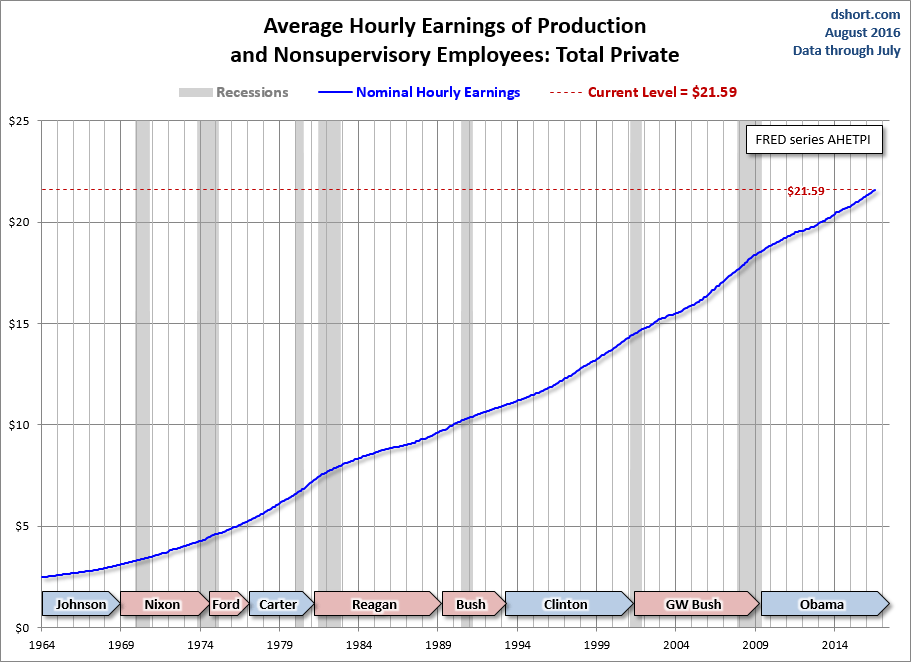
The first snapshot shows the growth of average hourly earnings. The nominal data exhibits a relatively smooth upward trend.
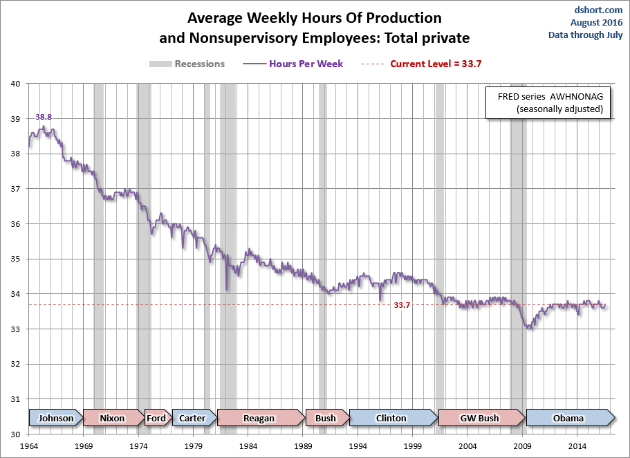
There are, however, two critical pieces of information that dramatically alter the nominal series: The average hours per week and 2) inflation.
The average hours per week has trended in quite a different direction, from around 39 hours per week in the mid-1960s to a low of 33 hours at the end of the last recession. The post-recession recovery has seen a disappointingly trivial 0.8 bounce (that’s 48 minutes).
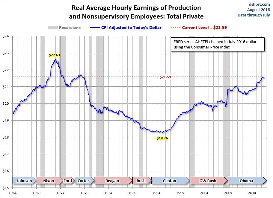
What about inflation? The next chart adjusts hourly earnings to the purchasing power of today’s dollar. I’ve use the familiar Consumer Price Index for Urban Consumers (usually abbreviated as the CPI) for the adjustment with a linear extrapolation for the latest month. Theoretically, the CPI is designed to reflect the cost-of-living for metropolitan-area households.
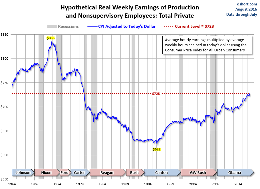
Now let’s multiply the real average hourly earnings by the average hours per week. We thus get a hypothetical number for average weekly wages of this middle-class cohort, currently at $700 — well below its $827 peak back in the early 1970s.
Note that this is a gross income number that doesn’t include any tax withholding or other deductions. Disposable income would be noticeably lower.
Latest Hypothetical Annual Earnings: $34,983, Down 15.4% from 42 Years Ago
If we multiply the hypothetical weekly earnings by 50, we get an annual figure of $34,983. That’s a 15.4% decline from the similarly calculated real peak in October 1972. By Doug Short, Advisor Perspectives.
And there is another trend. But how much longer can this go on? Read… Corporate Profit Margins vs. Wages in One Disturbing Chart
By Doug Short, Advisor Perspectives
http://wolfstreet.com/2014/11/21/five-ugly-decades-of-middle-class-wages/


